Thursday, 1 December 2016

The country Doctor, The Dad Project


The Country Doctor

Smith cleverly shot with no film initially so that the doctor would not only get used to his presence but also would become familiar with and then ignore the sound of the shutter.
The project documents the life of the Dr Ceriani, the project only last 23 days but in appearance seems to cover a longer stretch of time. While following the doctor, Smith was able to capture the work of Dr Ceriani as he helped the community. It is especially telling, when during a short break away from his duties, where he tries to relax and fish, he is called back to attend to an emergency. It is one of these shots that calls out to me as it expresses the helplessness feeling that Dr Ceriaini is having as he struggles to find a way to telling the family that although he has done all that he can it is not enough and that the girls eye cannot be saved.


W. Eugene Smith—Time & Life Pictures/Getty Images

The county Doctor is a uncompromising document which shows the life of the community and the hard but rewarding work of DR Ceriani.

Personally I prefer Smiths harder hitting photo essay Nurse Midwife, which documents Maude Callens work as an all encompassing health worker for the desperately poor of the rural south.

Cosgrove, B. (2013) W. Eugene Smith’s landmark photo essay, ‘nurse midwife’. Available at: http://time.com/26789/w-eugene-smith-life-magazine-1951-photo-essay-nurse-midwife/ (Accessed: 20 November 2016).

The Dad Project

The milkshake moment:

The image talks to me on multiple levels, it demonstrates the failing health on her father, suddenly losing his balance and dropping the milkshake, the splatter on the floor the colour of dried blood, the loss of the required energy drink which is the lifeblood of her father, something to try and increase his strength and this resistance to the effects of the cancer on his life.

Grappling with the plan; how to manage the project, Briony struggles with how to manage the concept and the documentation of the subject, does she plan what she will shoot, will she stuck to a methodology. In the end, she decides to documentation what she can as neither method nor pan would allow her the flexibility that she really needed to document the ongoing situation.

The main difference between the two essays is the emotional narrative within the overall context of the essay. The country doctor gives you an insight into the overall activities and situations that the doctor has to attend to and how this affected the many people that he comes into contact with. The My Dad essay is a much closer, emotionally guided narrative of just three people, it also has a beginning, middle and end narrative but at the same time leaves the viewer with some insight into how the narrative will continue to play out as the intense emotions captured effect each of the individuals left at the end of the essay. 

Certainly for me the My Dad project brought some memories and emotions back t the loss of my father and the ongoing loss of my mother to dementia 
  

Endng with ending; Brionys work has allowed her to express not only her feelings, but process them in a manner that grants the viewer a level of empathy with Briony. The Dad project is only the start of the project, the journey is really has just begun as others see it for the first time and their reactions and feelings interact with Brionys own.

Friday, 11 November 2016

Research Points for Assignment 1

In my attempt to keep the assignment 1 word count down to the advised limit, I failed to include enough information on where my ideas originated and how I worked on them to produce the submitted images. My tutor advised me to include more details on what I was thinking and what my influcences were.

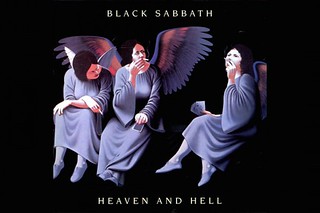
I decided to use the opposites of heaven and hell or demon and angel to support the principles of opposite. Being influenced by the front cover of the Black Sabbath album, I wanted to produce two distinct separate images, I could as the album image portrays did it in a single image but I wanted to enforce the two separate images principle.

For the Demon I first started with the traditional idea of a crone witch; I did not want to do a traditional witch so went with something closer to a Gothic witch. The first idea was to have the model with a large lace head covering, with the covering going from hear forehead and falling away at the back and sides over her shoulders. Her face was to be dual coloured running in a gradient with it changing too pure white just at her eyes.

I was attempting to obtain a other worldliness without going to Halloween, however the idea failed as the head covering did not look right and I was using a lens with a ring flash which itself was cropping into the picture reducing the available frame.

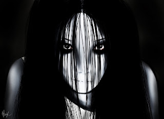
When I was reviewing the images I took, I then thought of the idea of a demon, but again I did not want to produce a cliche cartoon Halloween image. I decided that I would go with a mode modern look which was as otherworldly as possible but try to stay away from the ethereal. I wanted the demon to be as striking as possible. I then went with the influences of Japanese and Korean horror films, such as “The Ring”, “Ju-On The Grudge”, “The Eye” and “Kairo”. In these films the ghosts and demons have a stylised, mainly din plain pale colours with dark hair and ringed dark eyes. 


However I wanted the model to wear dark clothing to help isolate her face and unlike the ghost spirits of “The Ring” I did not want her hair draped over covering her face.

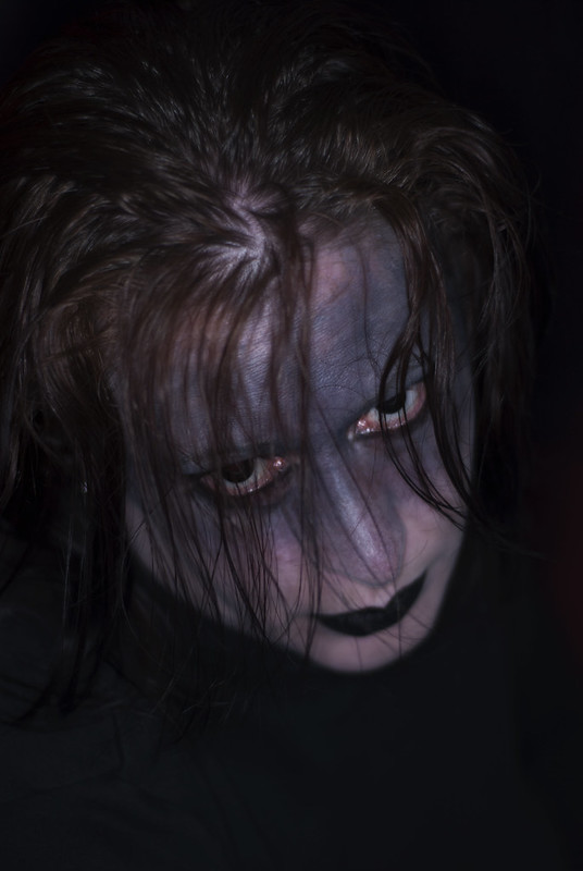
I used these ideas with the model by using black and white face paints and having her put in black eye contacts to cover the blue of her eyes, I then had her darken the top part of her face to enhance the darkness and give the impression that she was part of the darkness that surrounded her. I then pushed in close to her face with the camera using a prime 50 mm lens and the ring flash to get a close up without getting the ring flash highlight in her eyes. I shot her looking into the camera to show that she was aware of being photographed and that she was making direct contact with the viewer and unsettle them slightly.

Having captured this image, I then turned to the Heaven image. At first I examined the idea of using a modern angel, but I did not find the results satisfactory; the simple descriptions I came up with were too cartoon and almost Christmas like. After discussing this with my wife, I went back to the drawing board again with the idea of again making the image opposite by going back into the history of art and looking for a more renaissance influence but without the wings and the halo. My first idea was to draw together elements from different images, such as the hair from Leonardo Da’Vincis  “Head of an angel” and the dress from Giovanni Ambrogio de Predis “Angel in green with a Vielle”.


While I was reviewing these images, my wife showed me an image taken of Dame Gladys Cooper,

I then started to use this as another influence and looked at photos of Mary Pickford especially the Roses portrait and 


and images of English Victorian Actress Mary Fealy.


All these images were then again influenced by the work of Julia Margaret Cameron.


Pulling these ideas together I decided that I wanted a more natural image, based on the combination of both renaissance and Victorian imagery. 

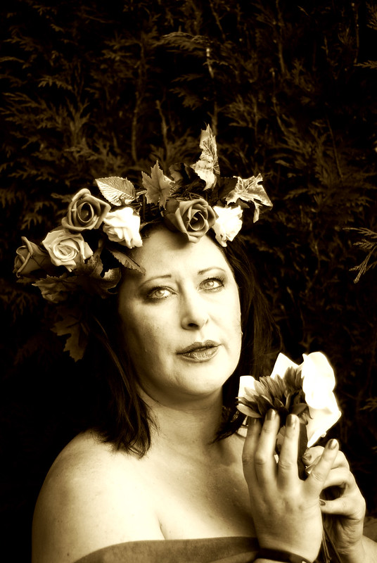
I had the model style her hair up framing her face with a crown of flowers to represent her oneness with nature, I also shot against a large hedge in natural light all to show that the model was in a natural environment. I took the final image and recoloured it with sepia tones as I thought that monochrome was too stark. I had the model look away from the camera lens while being bare shouldered as I was influenced by the renaissance artists and I wanted her to be viewed more of as a subject while not making the image voyeuristic. I wanted the viewer to see her as nature as a desirable state or entity rather than see her as a female subject of desire.

Tuesday, 27 September 2016

Assignment 1

How: I started the assignment with the idea of producing a number of social profile images showing different personality traits, however this did not work out as the ideas which looked good on paper did not gel when I tried to create the actual images.

Deciding to go with a different idea, I based the assignment submission on the idea of heaven and hell; taking the original idea from the  front cover of the Black Sabbath album of the same name where the image drawn by Lynn Curlee 

Black-Sabbath-Heaven-and-Hell

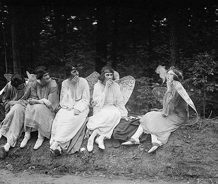
This image itself was inspired from a 1928 photograph of some amateur actors and actresses dressed as angels sitting during a rehearsal break. In this image they are sitting in an unangelic manner smoking.

smoking angels

I decided to push this a little further and have a more modern demon image for hell and a Victorian inspired image for heaven.

For the demon, I worked with the model using various makeup styles ranging from the 1930s green faced witch to the oriental dark haired ghost. The main issue I had was with the lace hat merging with the hair of the model making her head an angular mass rather than two separate distinct shapes. By accident I look a close up which when reviewed pushed me towards the J-Horror image of a demon/ghost with a white face and dark wet hair, we decided on black contact lenses to increase the other-worldliness of the final image.


Hell - Demon

hell - demon 


For heaven I bounced around the idea of a model angel with white wings and a halo but decided to backtrack to a Victorian representation of a more renaissance style image of a flower crowned individual. I decided to shoot outside in natural light, this time to help create a image with less harsh contrast. This colour image was then recoloured to a sepia image and the trees in the background burnt slightly to remove the distraction of the background, which may have pulled the eyes away from the foreground.

Heaven - Angel (Nature)

heaven-nature

Conclusion

I did find this a bit of a struggle as I bounced back and forth between ideas and concepts. I did get a little distracted at first but after nailing down what I wanted to produce the final images were created quickly.


False Image

What: Create a false Image digitally
Where: Home
When: Mid afternoon 
How: I first reviewed the coursework and played around with a few ideas.

At first I had planned on creating an image of myself levitating off the ground, however I just could not arrange all the parts together single-handedly in the end, My first attempts may have worked but it was taking too much time to organise and shoot.

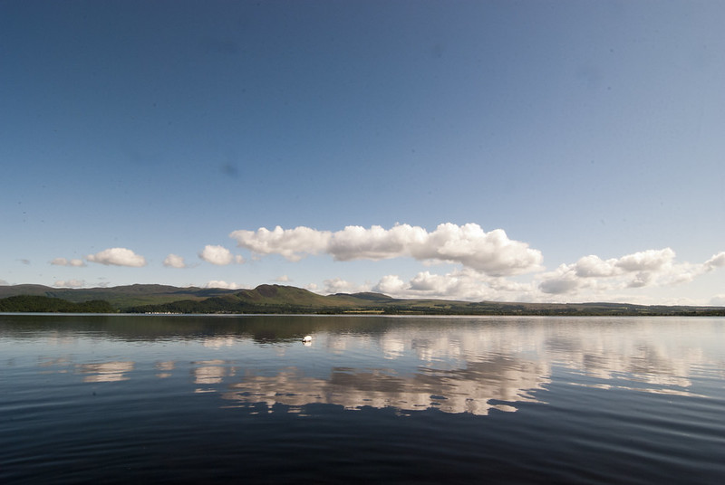
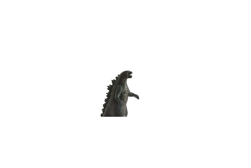
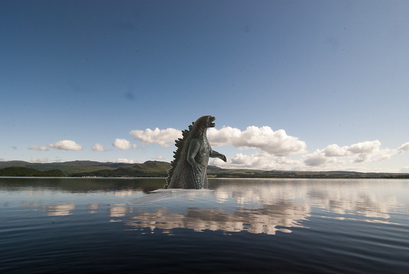
I then went back to the drawing board and while reviewing some images I remembered an image of the landscape around Loch Lomond. Drawing on that as the basis of the image, I first of all toyed with a "nessy" style image but I just thought that it was too cliche and too lazy an idea, Going back to the drawing board I then photographed a toy Godzilla that I had sitting around and used that instead.

Background

I then cropped the image down and removed the background and used the same image to distort and recoloured to make the shadow.


godzilla

shadow


I then used a piece of cloud and a pierce of water and distorting them both created the small bow wave at the front and sides.

waves


Finally compositing them together to produce the final image.

loch lomond godzilla

Conclusion.

I found this exercise quite fun as the main part of it was to produce such a false image that it could not be mistaken for a real image at all.

Thursday, 16 June 2016

Pre Work - Image manipulation


As I was preparing for the exercise I found a surprising internet article from PetaPixel (http://petapixel.com/2016/05/26/photoshopped-photos-emerge-steve-mccurry-scandal/) regarding Steve McCurry. 

The articles show that McCurry has been altering some of his images using Photoshop. In the articles it states that in one image a person has been moved in the image to provide a better composition. It follows this up with an investigation into other images produced by Steve McCurry.

One example shows a change in composition where a number of people and the rear end of a bicycle have been removed from the image to improve it. In another a small number of trees have been removed from the background.

These actions are not being viewed with a kind eye by many in the industry. The NPPA ethics committee regards some of the alterations to be an ethical lapse.

Mr McCurry is a photojournalist and a travel photographer and so his images should show some truth but at the same time he is trying to provide a clear image with a clear context and narrative so the viewer can get a good idea of his aesthetic taste especially when he is presenting the image as a travel photography image rather than as a journalistic image.

He has clarified that he has used contrast and tones to alter sections of images, however the images in question on Petapixel he has stated are changes made where elements of the images were moved was wok which he did not authorize and were carried out by a no longer employed lab technician.


I am not sure where I stand on this at the moment, as on one hand this sort of action has been performed by photographers for most of the history of photography and cannot really be construed as falsifying an image. However could his alterations be as the NPPA state, change the journalistic truth of the images and how did these images get to publication without double checking them before final approval. I am left wondering how much truth should be presented within travel photography, it is okay to manipulate an image to present a clearer composition of life in that location, but should the change in elements within an image change the reality of what is being presented.

Research Point - Paul Seawright - Sectarian Murders


The piece presents a series of images with sub titles which provide background information on the murder which was carried out at that specific location.

The viewer is presented with the image, which is a normal image, the sub titles provide the context for what you are seeing, the narrative however is driven by the viewer as they are asked to provide an emotional response to both the image and the information. You are allowed to feel emotions and thoughts on both the surviving families of the victims and for the people who found the bodies. We are at no point given much information on the victim or if the murder was investigated and the perpetrators convicted, this gives me a feeling of imbalance which drives the context and the narrative.

During the video the artist states clearly that in this series he is providing nothing more than the information and that the viewer provides the narrative, I feel that this is correct.

Personally I struggled a little with these images, as I grew up in a divided sectarian environment and I have taken a lot of emotional steps to get away from this environment, so my emotional response to these images was both sadness and negative as once again I failed to understand why people do this to each other.


Research Point - Contemporary Street Photography - Does black and white make a difference.


Having read the noted articles I reviewed a number of images from the listed artists;

In a large number of cases, I found that colour was used by the artist during composition to highlight particular details within the image and it was used as a device to catch the eye and draw in the viewer.

At first black and white photography was used mainly for photojournalism and few of the images were colourised, there would have only been a small number of occasions when this would have thought to have been appropriate. With the advent of colour, photojournalism moved into the use of CYMB printing technology to allow colour images to be printed as the news providers would have been looking for colour images to provide striking, eye catching front page displays to identify themselves from their competitors. However I feel at times that colour can be overused and in some cases the colour diverts the viewer’s eye away from the central narrative.

Certainly the use of colour has help drive photojournalism away from the surreal elements of early photography, as it helps to add realism into the composition.

In the case of Martin Parr he uses irony within his street photography; he uses the idea of britishness as an ironic force to present images where there has been non integration of British people abroad.
Personally I dislike these particular images as I personally feel that Martin Parr is sneering at the uncultured.


Looking over my own recent images I prefer some of the black and white versions to the colour versions as removing the colour has removed some of the distractions and provided a better narrative for the image.